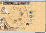
Let’s look at a web site that needs help:
 The Vatican (English site) (vatican.va)
A venerable institution doesn’t have a web site to match.
Navigation: The navigation is complex, with four different menus on the welcome page. As an added challenge, you have to mouse-over some of the buttons to find out where they will take you. And if you find something useful, bookmark the page, otherwise you may never find it again. Without a consistent menu system, it’s easy to get lost. Navigation should be intuitive to everyone, not just the site designer. If you go to visit, beware: there are dead ends in this labyrinth! Some pages have no navigation to let you out. Your browser’s back button may be your only hope.
Access: You don’t want to be someone using this site with dial-up access; most of the pages are all graphics-no text. It must take forever to load each page. They may be nicely laid out with some fancy (sometimes hard-to-read) fonts, but that makes them slow to load. Also, without text on the page, search engines have very little to index. The Vatican has a few other things going for them, but for the average business, a lack of text that includes key words related to your business is a real disadvantage if you need to get found through search engines.
Style: Speaking of text, when there is some, it is inconsistently formatted, with fonts and sizes seemingly applied randomly on a page. The overall effect is unprofessional. The easiest way to overcome this is for a site to use style sheets (CSS) which can consistently define the look and feel of the entire site. As a matter of fact, stylesheets are the principal design tool for web developers.
